MGRA501 Authorship
& Interaction
Open Type workshop (Digital Nature)
o
n
Dave Crossland
INSTRUCTOR (EUROPE)
Dave is an English type designer, best known for creating the Cantarell typeface: a beautiful contemporary Humanist sans serif. Made while studying for over 2 years in the Department of Typography at the University of Reading (UK, 2009), Cantarell was chosen as the brand type for the GNOME desktop. Dave is currently ‘Font Consultant’ to Google Web Fonts and has commissioned hundreds of typefaces from designers around the world.
Dave dreams of a free culture of visual communication, so he decided to free fonts. His Masters thesis related the history of the software freedom movement to the practice of type design.
The following characteristics are not present in all type designs, however they are variables that may be a part of your design. If this is the case, it is worth considering the degree to which they will play a role as a variable.
The letters on the left come from Playfair, which has a large x-height relative to its cap-height. The letters on the right are from EB Garamond, which has a smaller x-height. In the sample above, the size of the H has been adjusted so that they match.
Construction refers to the structure of the underlying strokes that form a particular glyph. Perhaps you can imagine the glyph's skeleton. The kind of construction to use is arguably one of the most important questions to think about, because the construction effects so many of the remaining choices, particularly if your design is going to feel somewhat familiar to readers.
However, the way strokes end (the 'terminals') and the 'serifs' are generally not part of what is meant by 'construction.' Construction is the skeleton of the glyph, while rest - width, weight, terminals - are all parts of the flesh.
Construction refers to the underlying strokes that form a particular glyph. The kind of construction you use is arguably one of the most important questions to think about, because the construction effects so many of the remaining choices, particularly if your design is going to feel somewhat familiar to readers.
FontForge is a full-featured font editor which supports all common font formats. Developed primarily by George Williams, FontForge is free software and is distributed under the 3-clause BSD license. It is available for several operating systems (including Linux, Windows) and Mac OS X and is localized into 12 languages.
The single biggest issue that makes type design different is the need for every glyph in the typeface to work with every other glyph. This often means that the design and spacing of each part of the typeface ends up being a series of careful compromises. These compromises mean that we can best think about typeface design as the creation of a wonderful collection of letters but not as a collection of wonderful letters. In other words we must think about the group and how it will perform together and prioritize this over any question of what is wonderful in a single letter.
This need to prioritize with the system rather than with any single part also leads to a need to analyse our design process on the level of the system. Characteristics which span letters become the things we want to focus on, particularly at the beginning of the design process.
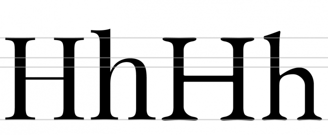
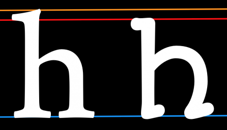
In the example above, the x-heights have been matched in order to illustrate the relative difference in ascender heights.
Ascenders usually exceed the cap-height by at least a little, especially in text designs. In some cases, however, they can match or even be lower than the cap-height. Longer ascenders can add elegance to the look of a typeface. They often go with smaller x-height.
a
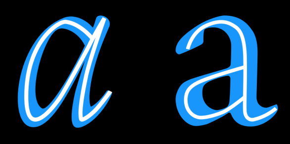
Speed
The n on the left seems to be written much faster than the one on the right. Speed is discussed in more detail in the chapter on italics.
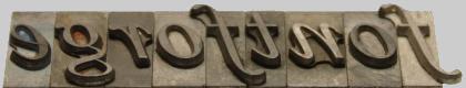
Regularity
Notice that in the font on top the flourish is more present in the capital letter and the second one the flourish is more in the lowercase.
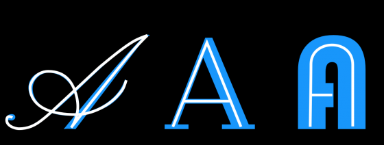
Flourish